Saturday, December 20, 2014

REVIEW: Death Moth #1

Creator: Joseph Morris
Publisher: Torc Press
Review: Art Bee

A couple of weeks ago our own Cody “Madman” Miller messaged me and asked me a question. “If I give you a comic book, will you promise to review it?” Never afraid of trying something new, I agreed very quickly. My expectation was a really off the wall comic, and I was determined to find something positive about it. Cody presented the comic to me this past weekend. The cover told me a lot about what I was in for.

The good news is I am still alive, but it was rocky for a minute. The urges of self-mutilation surfaced and threatened to inhibit my review writing capabilities.

The cover of this comic could only have been more effective if it was emblazoned with a biohazard symbol, although that would not keep everyone from opening it. Unfortunately the cover IS the best part and that is not saying much. It is mediocre at best. The death moth that has been drawn on the cover looks like the moth version of Nemo.

Take a breath and open the cover . . .

On the inside cover is the following statement:

"Warning!
This comic is not for children!
Viewer discretion is advised."

This is partially true. After reading the entire comic, “children” should be changed to “anyone”.

Death Moth is about Jack Hawksmoth, who happens to be a super hero. Anyway he gets murdered, goes to hell, and comes back for revenge . . . sound familiar? This guy even jacks the emblem of Spawn. HEY, TODD MCFARLANE WANTS HIS IDEA BACK! The story is really a shit sandwich. It is broken, hard to follow, and pointless. The writer obviously created this comic to publish his nasty minded filth, which he must view as creative.

Most solo independent comic creators who I have met or read are artistic and creative, so they need no one else to be part of the project. In the case of Death Moth, Joseph Morris needs to hire an artist, writer, and letter before publishing any more trash. The artwork is completely horrific. There is nothing well drawn here. After finishing the comic I had the urge to gouge out my eye balls, soak them in kerosene, ignite them, and overnight the ashes to Joseph.

The last point I need to make about this comic is Joseph’s focus. He has a crude and very, very disturbing fascination with penises. A description cannot be provided, because I have been violated enough already and refuse to regurgitate that crap. Trust me it is bad . . . very bad.

Cody “Madman” Miller can be expecting a groin punch in the near future followed by the return of this comic. Now I am going to curl up in a corner and cry. I may need therapy.

Friday, December 12, 2014

REVIEW: Bulletpoof Chicken

Script/Letters: Jon Westhoff
Art (1-8), 19) Bobgar Onnelas
Art (9-18, 20-29) Mat Nixon
Colors: David Halvorson
Review: Cody "Madman" Miller

I decided to do a review of a back issue this time 'round the prickly pear, at least that was my intention. The plan was to review quite possibly my favorite comic in the whole of my funny book horde, Undead Zombie Biker Chickens From Hell and Other Tales #1 . . . yes. It doesn’t have the greatest artwork or the greatest writing, but the little bundle of awesome is wrapped in my favorite cover of all time. It does indeed have an undead zombie biker chicken from Hell perched majestically atop his chopper complete with wheels o’ fire. Just picture the Ghost Rider but with a flaming chicken skull complete with that little red flappy thing that chickens have . . . it’s a gottdamn thing of beauty.

So anyway, I dug my ol' friend out of the short box that contains my most prized comics and that’s when I remembered I had purchased another chicken comic at a con a while back and hadn't gotten around to reading yet.
Poof! Enter Bulletproof Chicken.

Bulletproof and his partner are on the case of the Cluck Twins. BP doesn’t let people do bad shit in his city and live to talk about it. He’s been doing this for years. It’s just another day for the cock with a glock. Today would be different . . . sold.

This adventure starts with Bulletproof Chicken chicken-kicking his way through the wall of a restaurant while dropping a plethora of F-bombs. Shortly thereafter (one panel to be exact), BP and his partner Ed engage the evil lizard men behind the counter in a gun battle of epic proportions. Now, during this fight there is a guy in the background happily eating a chicken leg. At first I just thought this was meant to be some kind of corny ironic chicken nod. It turns out it kinda was because after all the Cluck Twin’s lizard lackeys are all dead, BP chicken-kicks a door in and there is Lisa, his hen, tied to a chair her left leg nothing but a bloody nub. That’s right, the Cluck Twin’s evil lizard lackeys fried it up and served it to the previously mentioned guy in the background. Kirkman, eat your heart out. That’s some demented shit.

Now enraged, BP puts on his mean face and chicken-kicks in another door (obviously his preferred method of dramatic entry) and faces off with one of the Cluck Twins. Bulletproof ends up blasting a cap in the evil doers face, but as it turns out Bulletproof isn’t so bulletproof and he is slain.

Fast forward 8 years into the future and Ed, BP’s old partner, is married with children to BP’s ex-wife (who now sports a robotic chicken leg). Ed gets a phone call from his old chief of police and is called in to inspect a crime scene. The scene is mass carnage with dead lizard dudes all hacked up and mutilated. Ed leaves the scene and shortly (2 panels to be exact) is busting in a room and there sits the Cluck Twin that was not shot 8 years earlier. As it turns out Ed and this Cluck Twin were in cahoots. The twin wanted his brother out of the picture and apparently Ed had a thing for BP’s wife. The two planned the whole attack 8 years earlier.
Bastards.

Shortly after Ed leaves (3 panels to be exact) he turns around and goes back in the Cluck’s office. He returns to find dead lizard lackeys and the evil Cluck Twin dead. The Cluck has a knife protruding from his forehead with a Business card from the restaurant where Bulletproof was killed. Ed rushes home but finds his hen and chicks murdered. With nothing to lose Ed heads to the aforementioned restaurant. Once inside Ed is confronted by the Cluck Twin who had been murdered 8 years prior in this very establishment. After the brief flash back ( 2.5 pages to be exact) explains that the Cluck had bionic part implants to cheat his way out of death. He explains how he also saved Bulletproof in the same manner. His plan was to control BP and make him do his bidding. Not long after this revelation (5 panels to be exact) as if on cue...BP crashes through the door again except this time he looks exactly like Robocop with a beak and robo-chicken legs. Then we are blessed with watching Robo-Bulletproof Chicken kill every living thing in the building (6 pages to be exact).
The End.

So, I confess, I was entertained. The story and characters were hilarious. I never take life to seriously. I will say the artwork could have been a bit more detailed. It was pretty bland in parts and came off as rushed and sloppy, but not to the point it hurt my eye holes. If given the chance I’d buy the 2nd issue in a heartbeat (7 heartbeats to be exact). Bulletproof Chicken now has a home in the mythical short box of awesome right next to Undead Zombie Biker Chickens From Hell. I guess I’ll need to make an official chicken section divider now . . . know what I mean Vern?

Friday, December 5, 2014

Interview with Ryan Browne 2014

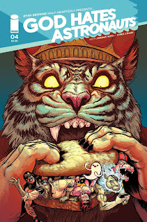
Ladies and gentlemen, boys and girls, mollusks and Protozoa, if you're unfamiliar with the work of Ryan Browne you're doing yourself and the world of comics a disservice. Browne has worked on Bedlam, The Manhattan Projects, Smoke & Mirrors and various other sundry books. His penultimate funnybook is God Hates Astronauts. From its humble beginnings as a DIY indie book, GHA has steamrolled it's way to Image Comics and is now on Volume 2.
I hear it outsells The Walking Dead.
That's a complete lie. I've never heard that.

In the past, the Hammond Comics Blog has wrangled Ryan Browne and squeezed an interview or two out of him (found in our interview archive), and we figured it was about time for another 7 Questions with Ryan Browne.
So without much further ado about nothing:

Hammond Comics Blog Question #1: If God Hates Astronauts was ice cream, what flavor would it be?

Ryan Browne: Uh, seriously? Well clearly it would be Neapolitan Astronaut Ice Cream! NEXT QUESTION!

HCB Question #2: Do you prefer to comic book sober or buzzed on adult beverages?

Friday, November 21, 2014

REVIEW: Wildfire Vol 1

Writer: Hawkins, Matt
Artist: Sejic, Linda
Review: Art Bee

Over the last two decades there has been a growing concern with the rising population and food production. “We’ll need to produce 70% more food by 2050 to sustain a world population expected to grow to 10 billion.” (http://techcrunch.com/2014/11/20/farm-2050/; accessed 11/20/14) With numbers like that, how can we produce more food with the same amount of land and resources? The answer is we can’t. This leads us to either finding more land and resources capable of growing crops or finding another scientific solution. Matt Hawkins and Linda Seijic have used this concept in their science fiction tale, Wildfire, from Image.

In Wildfire a group of scientists headed by botanist Dan Miller are working to solve this future dilemma by manipulating growth processes resulting in plants growing in a fraction of the normal time. At the beginning of the series the scientists are forced to give a demonstration before they are ready. They use a dandelion enclosed in a glass casing. The dandelion grew from a seed to a flower and the produced seeds in less than a minute. This was the success they were looking for, but due to an unfortunate clumsy accident the case was broken. This triggers the cascade of events that leads to the destruction of Los Angeles by plants taking over. “Wildfire” is the code name used by the government to indicate the uncontrolled spread of a biological agent.

Could you imagine the frantic “perfect lawn” people trying to keep ahead on dandelions that grow in less than a minute? That would be the death of many older people from the sheer heart attack rates alone.

This series from being to end (all four issues) was just incredible. Matt Hawkins built and conducted the story perfectly. Wildfire stayed on track and to the point while building great suspense. The characters were very dynamic and realistic with a spotlight-eager journalist, guilt driven scientist, and protocol bound military officer (just to mention a few).

Linda Sejic is a brilliant artist. Each issue is filled with beautiful and elegant artwork. In issue #3 (I believe), the reporter team is driving in a van. The image is looking at them through the windshield, and the windshield is reflecting the trees and surrounding objects without any loss in detail. Even all of her covers are absolutely gorgeous.

Wildfire was not listed as a mini-series which left me pretty sad when I found out that issue #4 was the last installment. At the end of the series they announce that Wildfire Vol. 2 will be in Fall of 2015. They give us the teaser showing that the plants have affected the insect population. Now if that does not sound exciting, you are not any kind of science fiction fan. The trade paperback for the series will be out on Dec. 3 for the awesome price of $14.99. I would suggest grabbing it and getting ready for the wildfire of insects next year. I hope people are stockpiling cans of Raid.

Tuesday, November 18, 2014

REVIEW: Death of Wolverine

Writer: Charles Soule
Penciller: Steve McNiven
Inker: Jay Leisten
Colorist: Justin Ponsor
Letterer: Chris Eliopoulos
Review by: Alexander J. Diaz


Wolverine, Weapon X. Logan, or any of the other names he has been called over the years, is one of Marvel’s top characters. Almost everybody loves him, or at least loves the action in his books. It's weird that such an amoral character has become such a guiding force in Marvel Comics, but he has and many thought he would always be there.

That fact has brought about this comic. The Big Two know that the only thing that sells more comics than a war or a crisis is killing a character, and killing a character that cannot die makes a good story. That is what put Marvel on the path to this comic, and (not-such-a-spoiler alert!) Wolverine does die. The problem is that if you’re taking the time to read this review then you know that comic characters come back to life all the time, so it loses its edge after a while.

We all know that Wolverine is coming back, especially since he has a new movie coming out in a few years. That means that the character will probably be brought back right before the movie premiers. The thing I take from this is that Wolverine will be out of the Marvel universe for a few years. That’s a long period of time to kill a top name character, so it is interesting move. I definitely went into this comic wondering how they would pull it off in a way that respected the character, and left you with the feeling of how are they going to get him out of this death. Oddly enough I think they did pull it off.

Tuesday, November 11, 2014

REVIEW: Second Avenue Caper

Writer: Joyce Brabner
Artist: Mark Zingarelli
Review: Will Dubbeld

The medium of graphic sequential storytelling is a funny one. Dozens of throwaway books are published per month, from major publishers to basement indies. All of these books are important to the preservation and propagation of the media but every so often a book is published that is important on a broader scale.
Second Avenue Caper is one of those books.

Many of our readers were not yet born in the early 1980s, many others young enough to only remember them through a hazy memory, like Vaseline smeared on a camera lens. The remainder, however, will vividly remember those early days when HIV first became prevalent, first as a problem relegated to the gay community, then becoming more widespread and branded an epidemic. Second Avenue Caper harkens back to those early days as a tightly knit group of friends in New Yorks gay community battles misconceptions, lack of medical care, and a general lack of public awareness about HIV/AIDS. The focal character is a nurse named Ray who takes to selling marijuana, first in order to supplement income, then to bankroll missions of mercy.

Experimental drug treatments that would alleviate the symptoms of HIV were available in Mexico at the time, not FDA approved, and this meant smuggling. Ray and his companions use the money from peddling drugs, favors garnered from running errands for the mob, and a sense of familial obligation to make runs across the Mexican border and secure medication for their community.

Although Second Avenue Caper seems largely framed around an altruistic moneymaking and smuggling scheme, the core of the book is about Ray and his group of friends. This is where Brabner's gift as a storyteller shines. The characters are bound, in many cases tighter than their own families, unified and fighting for the gay community and the lives of their peers. A rather sizable group of friends at the beginning of the book dwindles as members die, one by one, driving home the intense feeling of mortality that flows through Second Avenue Caper. Names, likenesses and locations are changed throughout the story, but the events depicted are true and serve as an excellent reminder of a darker time in our society, a heartfelt tribute to those who were there at the beginning, and those who didn't make it through.

I said before that I believe Second Avenue Caper to be an important book, showcasing a piece of American history that doesn't see much exposure in the comics industry. I don't mean in the way that Strangers in Paradise, or Bone, or Watchmen are important.
I believe it's important to society as a whole, not just amongst graphic novelists and comic book readers.

Sunday, November 9, 2014

No time for love, Dr. Strange


Post: William R. Davis, Jr.

My love of comics was inherited from my much older brother. Being 15 years my elder and a social outcast, this meant two things: we had plenty in common, and he had an old light blue Oldsmobile that made plenty of visits to the comic shop. Once arriving there was plenty left of his part-time supermarket paycheck to get a nod from the man working behind the counter. Those were some nice memories of simpler times.

Although the Sorcerer Supreme can no longer boast a monthly title of his own, there has been plenty of talk recently about his upcoming feature film which could prove to be pretty exciting. Marvel should’ve chosen to revisit the old Asian stereotypes of Ditko and Lee’s initial Strange Tales. Those first four issues were the best hands down. There are undoubtedly plenty of people who would disagree, but I would argue: “What’s better than ancient Tibetan high fantasy and the dark arts?”
Boom. Argument won. There’s nothing better.

While most covet Strange Tales #110, give me #111. I can easily afford an 8.5 CGC #111, and instead of getting Johnny Storm confounded by mirrors on the cover, I can see him battling Asbestos Man, someone I am sure my brother faced at some point being a child of the 70s and 80s.
I heard they used it to make soup after they pulled it from the public school walls.

Marvel should’ve taken a moment to do something different with the casting, and methinks they need to kick Kahn to the curb, although we all know that this will never happen.
Nothing against Cumberbatch, though.
He’s pretty good for a white guy.
My point is this: Tibet, Greenwich Village, and black magic is a guaranteed box office hit. It would sure make me happy, anyway. Marvel street cred is at an all time high after Guardians of Galaxy, so I will buy a ticket hoping that it is incredible. At the very least it will give me a license to bitch about it with impunity. I can already see the fanboys on Twitter picking nits right now. I think we can all agree that the worst thing that can happen is a visit from the Ghost of the Last Samurai.
There is a reason that I am not the CEO of a blue chip company. In addition to being dangerously unqualified, it would’ve been awesome to watch the internet explode after saying that Marvel Studios has just cast Tom Cruise as the next Dr. Strange in an otherwise all Asian production. That would definitely be good for a grin.

Friday, October 31, 2014

REVIEW: Chilling Adventures of Sabrina #1

Story: Roberto Aguirre-Sacasa
Artwork: Robert Hack
Review: Will Dubbeld

It's that time of year again, ladies and gents. The air turns to chill, leaves change color and drop to loamy earth, and costumed urchins prowl the streets panhandling for treats.

It's the best time of the year for a stereotypical comic book/sci-fi/horror fanboy like yours truly. The time of the year when things go bump in the night and rap on your chamber door, when Jaime Lee Curtis runs like Hell from a Shatner-faced ghoul, and T-Bird, Tin-Tin and the boys set fire to Detroit.
Peter Cushing's Van Helsing smites Christopher Lee's Dracula with the holy hand of God and all those old Misfits records sound that much better.
Somewhere H.P. Lovecraft's shade nods approvingly.

I love it.

I'd love to say I spent the month of October rolling around in Pre-Code comic books, but alas even in reprinted form those things are a bit pricey. That said, I search instead for the next best thing.

Quick caveat: Rachel Rising is the best horror comic on the stands right now and the lot of you should be buying it. For purposes of this experiment we'll take RR out of the equation.

Yoe Books tossed us a few affordable Pre-Code reprints, but not enough to slake my thirst. At one point my LCS was kind enough to stock a dollar box with a good sized run of Tomb of Dracula and that was a godsend.
Finally, a decent amount of publishers (who will remain unnamed) print a decent amount of horror titles (that will remain unnamed) written by a decent amount of highly lauded creators (who will remain unnamed). Unfortunately many if not all of these wildly popular horror comics are sub-par. C minus books full of trite human drama, eye-rollingly bad twists, or straight up barrel-scraping torture porn.
Few, if any, current horror books channel that lightning-in-a-bottle magic of an old EC comic or a Hammer Studios gothic horror film.

So I figured, what the Hell, I'll check out this Archie Comics zombie apocalypse book.

Impressed with that little endeavor, my brow raised with inquisitive scrutiny when I heard about a Sabrina comic in the same vein from Archie Comics.
I debated, hemmed and hawed, and finally opted out of pre-ordering the book.
Flash forward to Halloween Comicfest at my local brick and mortar shop and . . . well it is the season and it WAS Halloween Comicfest and there was only one copy left on the stand and alright fine give it to me.

Chilling Adventures of Sabrina #1 has a gimmick cover, a die-cut, nothing as 1990s cliched as a lenticular 3-D cover or, god forbid, a hologram, so it's a good gimmick on thicker, nearly cardstock paper. The interior pages feel almost a hybrid of slicks and newsprint and the book even smells unique, as if blended from a nontraditional paper recipe.

The art is fantastic, conjuring stylistic images reminiscent of 1970s horror comic magazines.
The full, magazine-sized books mind you, not the standard floppies.
Vampire Tales and its ilk.
The color palette is subdued, almost dull, with slashes of bright color here and there for a beautiful contrast on page and panel.

Roberto Aguirre-Sacasa opens the tale on October, 31st, 1951. Sabrina's first birthday.
It seems young Sabrina Spellman (I know, bear with me...) is the daughter of a Satan-summoning warlock who has promised his little girls upbringing to a witch coven.
Mrs. Spellman will be having none of these monkeyshines and she flees with baby Sabrina into the Dark Foreboding Woods.

Needless to say it doesn't end well for Mrs. Spellman...

After the brief intro, the book details several points in Sabrina's life and her burgeoning sorcerous abilities.
1957, 1962, and finally settling on 1964 as young Sabrina readies herself for high school, helped along by her cousin Ambrose and her 2 maiden aunts. We're introduced to her smart-mouthed cat familiar, Salem, a potential love interest, and by the end of the book we see a succubus summoned from Gehenna who appears to be a future antagonist for the teenage witch.

The book is great, not necessarily the elixir I need to fill the horror comic void, but a great book nevertheless. It's extremely atmospheric, a bit thick, stuffy like an episode of Dark Shadows.
The one with Jonathan Frid.
Not with Jack Sparrow...

There's more than a couple of Easter Eggs enclosed as well.
Ambrose mentions sending someone to "the cornfield" (canny Twilight Zone fans take note), his cobra familiars are scions of the Roman snake god Glycon (canny Alan Moore fans take note), and the two coed witches who summoned the succubus appear to be thinly veiled pastiches of Archie Comics own Betty and Veronica.

I'm on the fence as to whether I'll continue to pick this book up on the regular or not, but there's plenty of worse choices a reader could make. The script and art are solid thus far; it'll be up to the story arc's progression to pass final judgement on the book.
Curiosity has been piqued.

I'm off to convince Barbara Steele to read ghost stories for my bedtime. Until next time, kiddies, candy apples and razor blades...

Friday, October 17, 2014

REVIEW: Veil #1-5

Writer: Greg Rucka
Artist: Toni Fejzula
Review: William R. Davis Jr.

It feels great to be back writing for the HCB after a long hiatus. Since my last contribution, I have since moved into the vast frontier that is mainland China. Telling you that I have stories for days would be the understatement of the century, but if I can offer a quick vignette: just picture me walking down a trash-strewn open air market, eating a fresh slice of cantaloupe on a stick, and to my left squatting on the pavement is a small child peeing into the street whilst hundreds of unaffected onlookers riding bicycles pass anonymously.

But let’s be honest, I know you’re not here to bask in any of the nonsense that has become my life; your Twitter hashtag has directed you to this site because you are wondering whether to purchase this freshly completed miniseries by writer Greg Rucka and artist Toni Fejzula.

Monday, October 13, 2014

REVIEW: Translucid #1 (of 6)

Writers/creators : Claudio Sanchez & Chondra Echert
Illustrator: Daniel Bayliss
Colors: Adam Metcalfe
Letters: Ed Dukeshire
Review: Cody "Madman" Miller

My coffee table eats things. To be more specific I suppose it’s the dark void under the coffee table and not the table itself. The argument could also be made that the shadow the table casts is just an extension of the table itself . . .
Based on this final point I’d just like to go ahead and stick with my opening statement. My coffee table eats things.

Sometimes my coffee table regurgitates random things from time to time. That is the very circumstance in which we now find ourselves.
I found this book sandwiched between issue #3 and #4 of the David Hine Spider-Man Noir books that I had dug out of the amoeba with the intention of rereading an old favorite. Unfortunately my coffee table had other plans and into the void they went . . . until today.

I have no idea where this Translucid book came from. I don’t remember buying it. I don’t remember reading it, in fact I don’t think I've ever laid mortal eyes on this book before.
Ever.
I’m fairly certain that, if I had, I’d remember, because the cover is so ugly it hurts my eye holes. It’s Gottawful. It’s like drinking Wild Turkey from a fire hose, up the nostril, and that’s the Gottdamn truth. Today my coffee table puked up ugly. It happens from time to time.
Well, there’s more to the story. I was so happy that the first page and all the pages thereafter were not a reflection of the aforementioned fail of a cover. The pain in my eyes subsided and morbid reckless curiosity consumed me, so I bought the ticket.
It didn’t take long and I was totally and hopelessly lost. First we see a kid drawing a prototype for some suit of armor or the like, then suddenly we’re thrown into the world of “Horse Guy”, a villain who thinks wearing a giant white horse head mask is a super-awesome badass thing for a villain to do, and The Navigator, our hero who apparently is either:


-Too lazy to do the hero thing anymore

-Butthurt

-Just doesn’t Gottdamn care anymore

-With great power comes great responsibility


First, in as few words as possible:

The ass with the horse head tricks Navigator into thinking some other bad guys tied him up, rigged him to a bomb, and put him in the basement of the Empire State building. The hero goes to save his archenemy only for that bastard horses ass to sneak attack the hero with a quick jab to the neck with a syringe loaded with LSD.
Instantly I was blinded.
The damn comic turns into a black neon light wonderland of three eyed guys in horse head masks and other things you can only see while under the influence of mind altering substances or perhaps mid-coitus. It got neon . . . way, way neon.
Turn the page and we’re back to the little kid again. This time he’s just waking up from a nightmare, leading me to think that all this is going on inside the kids imagination or his dreams. Either way, unless issues #2-5 somehow find themselves into a dollar box I cross paths with, I doubt I’ll ever find out what transpired in the lives of The Navigator and the guy in the horse head mask.
Some things are better left within the dark void under my coffee table. Now the only thing left to do is lick page 19 and get on the Gottdamn day-glow bus headed to NYC.

Sunday, October 5, 2014

REVIEW: Nailbiter #6

Writer: Joshua Williamson
Artist: Mike Henderson
Colors: Adam Guzowski
Review: Art Bee

Earlier this year, Image started publishing a captivating series called Nailbiter. The title struck me as completely laughable, but the cover art was so sinister (pictured below). Since starting the series, it has become one of my most anticipated comics on my pull list.

Why did Friday the 13th, Halloween, Silence of the Lambs, Seven, and Saw do so well? They all involved highly motivated serial killers. Why do these types of characters and story lines appeal to the masses? It can be summed up in one simple word.

Drive.
A serial killer is quite simply the top of apex predators. An apex predator is a creature that has no natural predators and exists at the top of its food chain. For the most part serial killers do not eat their victims but do hunt, stalk, and consume them. The consumption gained is the result of the drive to murder. This can be in the form of sex, thrill, control, or any other form of gratification.

In the world of fiction, serial killers are a great, recyclable machine for terror. They are also a great platform to build awesome heroes and protagonists out of mediocre ones. That brings us to Nailbiter.

When the story started, FBI agent Eliot Carroll disappeared after figuring out that 16 of the country’s worst serial killers, including Edward “Nailbiter” Warren, were from one single town, Buckaroo, Oregon. Agent Carroll’s disappearance causes his friend Nicholas Finch from the NSA to come and figure out what happened with the local Sheriff Shannon Crane. Ironically they have to enlist Warren to help find Carroll. Since that first issue the story has been a roller coaster ride of a thriller.

In Nailbiter #6, the story switches gears into its next arc. By the sound of this issue we are going to get a taste of Buckaroo’s culture. At the beginning of the issue Alice (I think she is the niece of the Sheriff, but I am too lazy at the moment to go pull the last issue) is sitting in a diner when a new character comes onto the scene, Mallory. Mallory is a serial killer fanatic and wants her baby which is about to crown to be born in Buckaroo. She thinks, if the child is born in this town, the child will be a serial killer and make her famous. I absolutely will not share any more than that about this issue. You've got to admit that is just a creepy and weird way to start the issue and have to find out more, right?

Williamson has done a superb job at creating this story. He is continually building suspense while delivering gore and violence in a meaningful way. Gore has never bothered me unless it is pointless. There is nothing worse than gore that is overly done. Williamson uses developed characters, a dynamic setting, and a solid plot to build an absolutely sexy story.

Mike Henderson and Adam Guzowski combine their talents blast this story at us. Their work is good but not great. What I like about their work is how they use color and deliberate lines to project certain scenes right at you. For instance in the current issue on page 8, they deliver a doctor screaming as a large syringe needle is thrust through one cheek, the tongue, and out the other cheek. The image really pops out as you turn the page. The placement and delivery is absolutely brilliant. In my opinion, even though their skill is less than that of other artists, Henderson and Guzowski know how to use what they have and make it worth more than it is.

Check the series out. It is worth it. The trade collecting the first five issues will be out soon, and issue seven is promising a special guest. That special guest is Brian Michael Bendis. Hell, if Bendis is stepping over to have his name in it, it has to be worth something.

Friday, September 26, 2014

Review: I Was the Cat

Writer: Paul Tobin
Art/colors: Benjamin Dewey
Review: Will Dubbeld

I'm a cat person.
My family is cat people.
Nothing really against dogs, I just prefer cats. They're like a semi-ambulatory appliance or a piece of furniture.
A hassock, probably . . .

Anyway, cat people have a tendency to habitually anthropomorphize their pets, accrediting them with spades more intelligence than should be allotted.
Myself, not so much. My cats are generally as smart as a sack full of doorknobs.
Paul Tobin's fictional talking cat, Burma, on the other hand, is taking over the world with his intelligence.

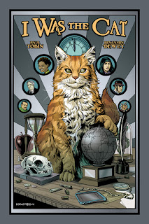
I Was the Cat spins the story of Burma, the titular cat, and his nine lives. Lives he's spent attempting to conquer the globe. From ancient Egypt to the trenches of WW1 and into the modern era, Burma has been pulling strings and manipulating players like Napoleon Bonaparte and Mary, Queen of Scots in his bid for domination. Chronicling his exploits for a memoir is Allison Breaking, a gutsy reporter in the tradition of gutsy women journalists. Allison is accompanied by her plucky friend Reggie, who treads water dangerously close to the Manic Pixie Dream Girl trope, but nevertheless serve as an engaging foil to Allison as the pair record Burma's exploits whilst slowly uncovering his plans for ruling the world.

Paul Tobin and artist Benjamin Dewey spin an engaging and incredibly entertaining tale in the pages of I Was the Cat. Certainly not pretentious or full of itself, and somewhat tongue-in-cheek at points, the books 186 pages (plus a couple of extras) are a quick, enjoyable read made all the better by Dewey's art which is detail minded but careful not to overcrowd the panels. The cover is especially engaging and well done, and it certainly is what drew my attention at the time of solicit. The inks and colors are a hair thick and muddy (respectively) at times, but certainly not enough to detract enjoyment from the almost watercolor look of the book. The color palette in daylight scenes is especially pleasing and contrast well with Burma's flashbacks which are primarily monotone in color.

I Was the Cat is a smaller (6"x9", roughly), beautifully bound hardcover available from Oni Press. The price point may give some readers pause at $24.99, USD, but it's well worth the price of admission.
Trim a few books from the Big 2 you'd otherwise buy this month and pick up I Was the Cat instead.

Let's be honest. You don't really care about "Futures End" or the "Death of Wolverine" anyway . . .

Friday, September 12, 2014

REVIEW: Copperhead #1

Writer: Jay Faerber
Artist: Scott Godlewski
Colors: Ron Riley
Letterer: Thomas Mauer
Review: Cody "Madman" Miller

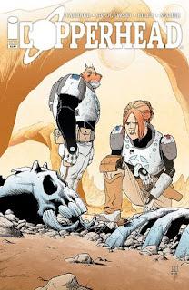
There it is! That 'holy shit' moment where you lose control of your bladder and most of your motor functions . . . where you’re like, "F me, I’m sitting here feeling like I bathed in Novocain and a tiny bit of my own urine but you know what? It’s perfectly fine because that was a Gottdamn great comic".

Reading Copperhead is like touching boobs for the first time . . . Mind-blowing. Bags of sand.

Seriously though I’m not even kidding. Not even a little bit. Zero, kids.
I’d go as far as to say right now, one review into the HCB’s new calendar year, that Copperhead is the comic of the year. I know its only the first issue but that doesn’t matter to me because it’s that good.
I’ve been a Jay Faerber fan ever since I read his Near Death, another great book. To be totally honest I kind of forgot about the chap until I picked up Copperhead. It won’t happen again.

Tuesday, September 2, 2014

The 2014 Hammy Awards

Ladies and Gentlemen, girls and boys, neckbeards and gamergirls, tentacled other-beings and pin-up models, gather 'round!
Herein lies the 2nd Annual Hammy Awards, brought to you for the low, low price of free (donations accepted) by myself and the rest of the staff at the Hammond Comics Blog.
Without further ado, if you dare, step right up and see the freaks of nature that the Good Lord has seen fit to grace us with the 2014 Hammy Awards!

Art Bee's picks:

The last year has been a mostly decent year in comics. DC had their major villains push while all of our DC heroes took a short vacation, but at least we got Joker’s Daughter out of the deal. The issue that introduced her with the 3D cover was a great comic book (I even considered it for Comic of the Year).
Marvel has been doing some very interesting things since the reboot, such as breaking time, killing the Watcher, bringing us the offspring of Wolverine and Mystique, and the return of an old favorite, Peter Parker.
Image has done a great job at giving many creators the chance to be published, and this year we have seen the main stream birth of several good series. Of course we have also seen some crap come out with them. Now let’s look at some of the best and worst comics of the year with the Second Annual Hammy Awards.

Sunday, August 17, 2014

Interview: Jeffrey Morris from FutureDude Entertainment

Interviewer: Art Bee

About a month ago, I was presented with a preview copy of the new Sci-Fi comic book Brainstorm from FutureDude Entertainment. I was thoroughly impressed with the story setup and began finding out more about the company. This led me to contact the FutureDude, Jeffrey Morris, to present him with Another Seven Questions.

1) Hammond Comics Blog: FutureDude Entertainment is a fairly new company. Please tell us the story of how FutureDude came into existence and its vision for the future.

Jeffery Morris: I am really interested in three major areas: science (exploration), entertainment, and education. I founded FutureDude in 2010 as a way of unifying those unique disciplines. I grew up with an avid interest in space exploration, oceanography, and meteorology. My company reflects these interests by wrapping them in nearly two-dozen intellectual properties. These IPs are all sci-fi and cover a range of topics that have influenced and inspired me—from parallel universes to weather manipulation. We are building upon these ideas to create comic books, mobile device games, feature films, and television projects. I also hope to expand into related merchandise like toys! I miss the days of cool futuristic toys!

2) HCB: Mr. Morris, who are you? In other words, what makes you the FutureDude . . . of FutureDude?

JM: I’m an artist and entrepreneur. But most importantly, I am a dreamer. I have always looked forward instead of backward. I grew up believing in the promise of stories like Star Trek and Space: 1999. I imagined a futuristic world populated by smart people doing amazing things. Pushing the envelope and expanding horizons. The gender and racial diversity reflected in 60s and 70s science fiction gave me hope as a child for a better tomorrow than the one I faced as a sometimes-bullied kid growing up in the suburbs of Phoenix. I have worked hard to create connections between scientists, educators and the public through my work with NASA/JPL and individuals like astronaut Buzz Aldrin. I have worked with kids to create curricula about the future while sharing visions of science and tomorrow. I try to infuse everything I do with sleek, believable design and forward-minded art direction.

3) HCB: What would you say separates FutureDude’s science fiction apart from the rest of the sci-fi genre?

JM: Big ideas mixed with real human stories. Spectacular production design and art direction—all created to serve a specified brand experience. We also try to focus on realism and plausibility. Starting from a basis in fact makes for some interesting storytelling. Very few stories in popular science fiction focus on a reality based approach. Aside from 2001 and a handful of other stories, movies are more about fantasy with a number of made up elements. We do occasionally stretch concepts. For example, in Brainstorm, we pushed the existing Fujita and Saffir-Simpson scales up by an additional number. This was done on purpose. We are completely aware the current limitations, however, we wanted to say that storms get so severe in the future that the scales have to be expanded. Science evolves. So should our perception of it — as long as there is a reasonable explanation for why and how it all changes. In many of our stories, we try to stay are real as possible, while perhaps breaking a few rules to maintain the fun factor

4) HCB: On futuredude.com, it states that it is “changing the face of science fiction in 2014”. It looks like this campaign will be starting in August with the release of Brainstorm. Please tell our readers in your own words why they should order this mini-series.

JM: Brainstorm is at its core, a human drama. It is interspersed with cool technology and a rip-roaring disaster film-style adventure. If you like your science fiction tinged with humanity, I think you will definitely enjoy it. It has fun twists and turns and a ton of surprises. The story also features a gay protagonist, something that is not typical in today’s marketplace and something that readers searching for diversity are clamoring for.

5) HCB: I am a huge fan of multidimensional thinking, so the premise of Parallel Man (Oct. 2014) is very exciting. In the series Agent Nick Morgan fights against the evil Ascendancy across the multiverse. How is the multiverse handled and traveled in the series?

JM: There are multiple concepts regarding how and why a multiverse might exist. I decided to look at quantum state as our basis. The Ascendency has developed “skipping” a technique that basically changes the “tune” of objects light changing a radio dial. The effect is visually spectacular and it extends beyond moving objects to actual weaponry in the story. We have everything from “skip bombs to skip pistols” — all of which alter quantum state and send objects between universes.
In the Parallel Man story, we have a hierarchy of universes that are conquered and explored. Alpha worlds are controlled by The Ascendancy. They have used their technology to control twelve worlds. Ours is next. Beta Worlds are ripe for exploitation with potential slave labor and resources. Gamma worlds are deadly and unfit for annexation by the Ascendancy. We visit all three in the story.

6) HCB: Next year FutureDude has planned on publishing a series called Oceanus. The series features survival at the bottom of the ocean after an asteroid collides with Earth ending life on land. Is there anything else you can tell us about the series?

JM: As of right now, we are focusing on producing a film project as opposed to a comic book series. I am directing it and it will be shot in Hollywood this Fall by an amazing team. I have assembled veterans who worked on films like The Abyss and Star Trek: The Motion Picture. My goal is to revitalize the underwater sci-fi genre. I will have more info on that project soon, including cast announcements.

7) HCB: If you were able to instantaneously receive one piece of futuristic technology, what would you get and why?

JM: My immediate inclination would be to have a transporter or replicator, but I would have to go with a Spinner—the flying car from Blade Runner. It would look extremely cool while allowing me to experience the dream of flight in a very fun and practical way on a day-to-day basis!

All of us at The Hammond Comics Blog would like to thank Jeffrey Morris for his time and awesome answers to our Seven Questions. It looks like Science Fiction fans will have a lot to expect from FutureDude. Be sure to check out Brainstorm and keep your eyes out for Parallel Man as well.

Saturday, August 9, 2014

PREVIEW: Binary Gray #8

Publisher: Assailant Comics
Writer: Chris Charlton
Artist: Rowel Roque
Colors: Anthonie Wilson
Cover: David Hollenbach
Review: Art Bee

During my review of Binary Gray #7, I described it as the eye of a hurricane. The calmness after the fallout of Issue #6 made it a good analogy. What I was not aware of was exactly how good of an analogy it was. Now that the calm eye of the storm has passed, we are hit with winds from the opposite direction. If you are reading this series (and you should be if you are interested in comics at all), Issue #8 is going to hit you like you are standing in someones back swing. Once you come to, you will be saying, “Wow!” rather than “Ow!”

The past several issues have been more about The Virtue and the Agency. They have been at each others throats trying to either protect or capture Alex Gray and his unusual powers. Issue #8 is primarily focused on Alex and his current situation. The cover of this issue should give you a pretty good clue as to what is about to happen.
The issue is entitled “Karma Police” and starts off with a huge piece of Alex Gray’s background. This first portion is centered on his father back in 1972. Even though this is a huge piece of the puzzle that is Alex Gray’s past, it raises more questions than it answers. Chris Charlton is doing a superb presentation of the story line and backstory. The last few issues have been ending in cliffhangers. When you reach the end of “Karma Police”, you will need to remind yourself to close your mouth. The ending will leave you in disbelief.

Now that I have mentioned the cover, David Hollenbach deserves some cheers for his unbelievable work on this cover. As I have mentioned before, David H.’s style and technique is very unique and gorgeous, and this cover featuring Alex Gray’s face is no exception. On September 19th the Cincinnati Comic Expo begins, and Chris Charlton has informed me that Hollenbach is supposed to be in attendance. It will be a great honor to finally meet this gentleman and talk to him, so be looking for a possible interview in the near future.

Rowel Roque and Anthonie Wilson have gotten back on the same page in this issue. In Issue #7 the coloring was off and looked very bland. Fortunately this is not the case in Issue #8. The coloring looks great. Shading and line look really clean and well done. My favorite panel in the issue is on page 8, the long panel on the right, where Alex Gray extends his finger and thumb causing an electric blue image to form at the end of the finger. The blue in this panel really sets of the image and the rest of the work on the page. The electric image looks to be really glowing blue.

Again I would love to provide spoilers and talk on and on about what occurs in the issue, but then why would you pick it to read it? That would not be very fair to Chris Charlton and Assailant Comics. Binary Gray #8 will be available in about two weeks. Preorder yours today at AssailantComics.com. While you are there you can download the first two issues of Binary Gray for free straight from the company. This series is getting really juicy. I am just waiting for a “Luke, I am your father” moment to spring forward in any issue in the near future.

Friday, July 25, 2014

REVIEW: Alien Legion, Uncivil War #1

Alien Legion: Uncivil War #1

Story: Chuck Dixon
Pencils: Larry Stroman
Inks: Carl Potts
Review: Will Dubbeld

Fans of obscure 1980s military science fiction comics rejoice! Alien Legion has returned!

First appearing as part of Marvel Comics Epic line, Alien Legion was described as the French Foreign Legion in space and told the tale of Force Nomad, composed of, “Footsloggers and soldiers of fortune, priests, poets, killers and cads—they fight for a future Galarchy, for cash, for a cause, for the thrill of adventure. Culled from the forgotten and unwanted of three galaxies, they are trained to be the most elite, and expendable, of fighting forces. Sometimes peacekeepers, sometimes shock troops, the Legion is sent into the Galarchy’s most desperate internal and external conflicts. Legionnaires live rough and they die hard, tough as tungsten and loyal to the dirty end.”

If that doesn't get yer blood pumpin' for some sci-fi action, go read Distinguished Competition's far inferior Legion comic . . .

Alien Legion was a staple of my youth, as back issues were plentiful in the quarter bin of my old comic shop. The art was phenomenal, the scripts were visceral and packed a punch, and any character (with a few exceptions) could die at any time. An almost revolving door of cast members attested to their mortality and as a youth I was glued to this book.
Riveted, even.

Hearing the news that Titan Comics was dragging the Legion through the mud again after years of inactivity brought a smile to my face.
Ear to ear, ladies and gentleman.
The fact that series originals and favorites Chuck Dixon, Larry Stroman and Carl Potts were back on board iced that cake. I promptly preordered and eagerly awaited.

Issue 1 arrived.
Page 1 was a full page spread of gunfire.
This was like slipping into your favorite comfy shoes after losing them in the closet for a decade.
Uncivil War's premise revolves around the Legion's age old enemies, the Harkilons, who are currently embroiled in a civil war. Harkilons are a race of reptilian...insect...
I dunno. They're bad guy aliens and the elite leaders can change shape. In any case, these evil aliens are having a civil war because without that deus ex machina we wouldn't have a comic book. Refugees from this civil war are fleeing Harkilon space and the Legion must serve as a border patrol for all intents and purposes.

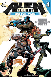
Uncivil War #1 lays a bit of groundwork for the story, but serves mostly as a shoot 'em up on the ground and in space both. Readers familiar with the series see the returning staple characters; Sarigar, a serpent-tailed stoic warrior who serves as Force Nomads commanding officer, Torie Montroc, a nobles son who volunteered for the Legion, and fan favorite Jugger Grimrod, a cutthroat, hardened criminal.

The action is nearly nonstop, I fear because Uncivil War is a miniseries and that leaves no time for foreplay. Fans familiar with the Alien Legion universe will be able to plug right back in and go but I fear new readers may be at a bit of a loss, bombarded with strange terminology and stranger characters. Dixon and Co. have tempered that a bit, as the issue is bookended with a few pages of character bios and a glossary of Alien Legion lingo.

Larry Stroman and Carl Potts are on point with the art, giving us clean, detailed panels with a very poppy color palette. I've always been a fan of Stroman's art due to its otherworldly style, which has mustered a few complaints from folks I've talked to who've read his more mainstream work (i.e. X-Factor). It's never bothered me in the least, but I could see the point of view. No such issue could be argued in his Alien Legion work as it's composed of bizarre extraterrestrials and technology. His unique vision is applied perfectly, and I couldn't be happier to see him back in familiar territory.

Alien Legion might be a tough sell for new readers but I'd highly recommend the book to fans of science fiction, especially fans of settings not bogged down with hyper-sterilized Utopianism. This isn't a neatly dry-cleaned and pressed Star Trek sci-fi book, this is dirty sci-fi, a used, lived in sci-fi with grit in its teeth like Blade Runner, Alien, or the Warhammer 40,000 universe.

It's difficult to give an unbiased opinion of this book as I've been enamored with the material for nearly 25 years, but I'm not a bit ashamed to unabashedly support Alien Legion and I'd suggest the lot of you ladies and gentlemen do the same. Scour through some longboxes for back issues of the original series while you're at it. You'll be pleased with what you find, just don't get overly attached to some of those early characters . . .
My only complaint about Alien Legion: Uncivil War is the fact that I believe it's only a four-issue miniseries and not an ongoing one.

Perhaps this is the last we'll see of the Alien Legion, perhaps not. In any case, kudos to Titan Comics for bringing the series back and Long Live the Legion!

Friday, July 18, 2014

PREVIEW: Binary Gray #7

Publisher: Assailant Comics
Writer: Chris Charlton
Artist: Rowel Roque
Colors: Anthonie Wilson
Cover: David Hollenbach
Review: Art Bee

This issue of Binary Gray resembles the calmness of the eye of a hurricane. Issue 6 delivered an action packed issue with all of the grand excitement we all love to see from super hero battles. Issue 7, “Take Me Home”, presents us with the fallout of the events up to this point and also sets us up for another big clash with the Agency, the organization that is after Alex Gray. For the entire series, I have had great things to say about each issue, and this one is no exception.

The cover of Binary Gray #7 is another winner from David H. The cover shows the fight between Dash, from the group Virtue, and Optimo, a new villain, fighting high above the city. The image looks like it uses a photo of an aerial view of a city as the background, and the characters are drawn or painted onto the background. The look on Dash’s face is what really sets the image off, and my eyes were just drawn to it.

“Take Me Home” continues the saga of Alex Gray. In the aftermath of the battle with the Agency, Alex Gray is feeling a lot of guilt over the injuries suffered by Chris, the retired Cross. His guilt leads him to leave the Virtue’s headquarters against popular opinion while the rest of the group splits in two other tangents. Meanwhile we get another piece of the puzzle of Alex’s past.

Now I have read many comic books where an issue has left me with a huge cliffhanger, and usually the next issue resolves it. Charlton has done something totally surprising with this technique; he has extended it with issue 7. In essence, he left us standing on a cliff then handed us beer goggles. It’s great. Binary Gray #8 is going to be huge by my prediction, and I can’t wait to see what’s in store for our hero.

I have become a fan of Chris Charlton’s writing over the last year. His writing and editing is remarkable, but there is a problem with Binary Gray #7. If this is the first issue of the series someone reads, they are going to have a problem with knowing the names of two of the major characters. The Moth is not identified at all and has several panels of dialog. The Cross is only identified with his real first name, Ken. This does not affect the story at all but could leave a new reader wondering.

From the start of the series, the artwork of Binary Gray has been really good. Rowel Roque and Antonie Wilson have been a great combination. In this issue, they seem to be out of sync. My first read of the issue left me completely feeling that Roque was losing his touch. After my second read I compared issue 7 to the last two issues and found that the coloring was not as intricate. The shading and shadowing quality has faltered in this issue. My hope is this is just a fluke.

Binary Gray has been one of my favorite comics for the last year, and I feel very fortunate to be allowed the opportunities to preview the issues. Binary Gray #7 is due for release on July 30th. The issues will be available for $3.99 (hard copy) and $0.99 (digital) at Assailant Comics’ website. Some great news is the release of issue 8 is just around the corner. I have said this before and I am saying it again, if you enjoy reading super hero comics, you should give this series a try. It is a great read and an original idea. You can get FREE digital copies of issues 1 and 2 directly from Assailant Comics right here. Everyone loves free stuff, so go get yours.

Monday, July 7, 2014

REVIEW: Proud

Written and Lettered by - James Mulholland
Art and Colors by - Caitlin Soliman
Review by - William R Davis Jr.

Read “Proud” here.

Rising costs will eventually make print comics as a business largely unviable. That being said, most Fanboys will agree that actually holding a print comic, the trip to your LCS, the ritual itself, is something that keeps diehard comic fans consistently putting skin in the game. However, most if not all will agree that webcomics are the future. The tablet has made reading digital comics a thoroughly enjoyable experience. They're cheaper, and by this point we’re all aware that the collectability of modern print comics is largely a myth. Try to sell your collection and you’ll quickly discover that they have little to no resale value.

Sometimes it’s nice to take a break from a huge and expensive six issue arc and check out a vignette webcomic, especially one with a soul, well written, and beautifully drawn like Proud by Irish writer James Mulholland and artist Caitlin Soliman.

When delving into Proud, I initially thought that I was being swindled into reading a cliché, hackneyed superhero comic for children. Thankfully within four pages I was proven wrong. Caitlin Soliman’s vibrantly colored art draws a sharp but necessary contrast, complimenting the story well.

The writing uses an almost overly ample amount of foreshadowing. After multiple reads this is the aspect of Proud that I have thought about the most, but ultimately I find myself a bit conflicted here. Maybe thirty percent of readers are going to realize what’s coming next. Admittedly I was in the seventy percent; and these numbers are wildly speculative. No polling data was collected.

The final panel is extraordinarily well executed, heartfelt, and richly illustrated. Proud is easily James Mullholland’s strongest effort to date and Soliman’s art works perfectly. Keep an eye out for the release of Mulholland’s debut graphic novel Jorund. The teaser pages online have me sold on the book already, well ahead of the release date.

Sunday, July 6, 2014

REVIEW: Wizzywig

Story and Art: Ed Piskor
Publisher: Top Shelf Productions
Review: Art Bee

While I was at Appleseed Comic Convention in Fort Wayne, Indiana, earlier this year, I had the pleasure of meeting Ed Piskor, and he thought I would really appreciate his graphic novel, Wizzywig. He was not wrong. I have loved every page of this fantastic story. This graphic novel is a captivating portrayal of the life of a hacker and is packed with interesting bits of knowledge from their world.

Wizzywig tells the story of Kevin “Boingthump” Phenicle, from his days as a child learning ways to get free bus rides to scamming the phone company and much more. This novel is fascinating for a couple of reasons. First, this story is not driven by suspense, drama, or any other mode I am used to finding in comics or novels. Instead Ed Piskor uses pure curiosity to pull the reader through the pages of the book. The second is there is no way to provide spoilers to this book. From the very beginning of the story we are told that Kevin is a hacker and gets incarcerated.

Piskor uses a few useful tools to drive the story. One of the key tools is “Off the Rocker” radio show that is hosted by Winston Smith, Boingthump’s best friend. This radio show is used to educate the public on the status of Kevin’s incarceration and to rally support for him. This show appears in each chapter and keeps the end of the story in focus. The second tool Piskor uses is the periodic public panel groups that provide insight on how different people view Kevin. These opinions are funny, entertaining, and really sculpt the rest of the story. The third method Piskor uses to keep the reader into the story is providing hacker tricks and cons that work. The rest of the book is a series of adventures that build the story of Kevin Phenicle’s life.

Ed Piskor’s art is excellent, utilizing colorless ink drawings that are truly effective. Each panel builds with the story and communicates the scene well. Piskor’s talent for creating such clear expressions on the characters faces is fantastic. There is not a lot of action scenes in this book, but the action that is depicted is very clear and concise.

If you are looking to read something different, go get a copy of Wizzywig. This graphic novel is entertaining, educational, and captivating. Though Kevin “Boingthump” Phenicle is a fictional character, his personality has been developed so well by the writer that it feels as if he is real. This novel is available from Top Shelf Productions for $19.95 for the hard back book, and digital copies are available for $7.99.

Friday, June 27, 2014

PREVIEW: Open Tree: Legends and Tall Tales #1 – Freedom Run

Writer: Chris Charlton
Artist: Brian Latimer
Colorist: Vasco Sobral
Review: Art Bee

Everyone loves a great story, and I have the privilege of introducing to you to one of the best I have read. After reading it five times, it is not getting old. Open Tree, Legends and Tall Tales #1 contains a one-shot story called “Freedom Run,” and each future issue will be its own one-shot as well. This supernatural western is full of plot points that will pull your emotions in different directions. Let me give you just a taste of what you find on the first two pages.

“Freedom Run” is a powerful and compelling story set in 1872 Texas. The main character, Jesiah, is a young man who has lost his parents and is having to care for his family farm alone. During a walk he finds what he assumes is a wild horse with its back hoof tangled in a barbed wire fence. After freeing the horse, he is surprised that it does not run off and takes it to his barn to care for it.

Friday, June 20, 2014

REVIEW: Axe Cop: The American Choppers #1 & #2

Story: Malachai Nicolle (age 10)
Pencils, inks, and lettering: Ethan Nicolle (age 33)
Colors: Dirk Eric Schulz (age 31)
Review: Cody "Madman" Miller

Hells yes! The Nicolle duo are back with more Axe Cop insanity. Just take my money.

I still find it amazing that a ten year old could possibly entertain me this much. In truth it’s really the fact that the writer is ten that makes this book so amazing. After reading only the first couple pages it was obvious that a ten year old's imagination is driving the bus, and in this case that’s perfectly fine.

There are parts in these first two issues of this three issue mini-series that seemed really dark to be coming from a ten year old’s brain. There are parts dealing with God, Satan, murder demons etc. Deep stuff for a ten year old.

I know at the end of the day it’s all for laughs but it did make me stop and think about how desensitized humanity is becoming. Like I said, Malachai is on point. By fifteen this guy is gonna have the big two gagged, bound, and bent over the proverbial barrel at least I sure as hell hope so.

In case you’ve never read Axe Cop before, let me fill you in. There is a cop. The cop has an axe. Axe Cop has the world by its balls. Anything goes and it usually does. Case in point . . . Wexter.

Wexter is Axe Cop’s pet bad guy eating T-Rex with machine gun arms who can transform into a dragon with rocket wings. Anything goes.

Demonic lumberjacks are charged by Satan himself to kill Axe Cop. They attempt to do so by creating little evil axe monsters and the like.

Axe Cop, with the help of his super team brothers, Axe Goat (who has diamond teeth and can chew through anything), Axe Dog (super smart, real Reed Richards kinda vibe), Axe Captain, Axe Girl, Super Axe, and don’t forget Wexter, must beat back the legions of hell and whatever else Axe people and animals do.

$3.99 is all you need for a ticket to awesome and back. I really can’t recommend this book enough. It’s cover to cover good times with a side of noodle salad.

Friday, June 13, 2014

Spotlight: Image Comics

Spotlight on:
Image Comics

By: Will Dubbeld

This past week I've been trying to catch up on bagging/boarding 3 or 4 months worth of funnybooks. Were I not a slacker I'd do this weekly instead of quarterly.
I am, however, extremely adept at procrastination and therefore reap the rewards of bagging piles of comics from my pullbox and various Internet purchases.
Because who doesn't want an 11-issue run of Where Monsters Dwell from the '60s? (thanks, eBay...)

Point being, I buy an obscene amount of comics and have noticed an odd trend lately.
Many of these comics are Image books.
I'll impulsively throw books on my pull list based on how well Previews sells them, and the past few years I've been sold on Image.
Don't get me wrong, I'm a Marvel Zombie for life, I don't think I could ever be anything else. It's encoded in my DNA, or subliminal messages contained in Stan's Soapbox brainwashed me, or some other ludicrous theory. The House of Ideas can churn out the weakest of stories bent on retreading old ground, and I'll buy into the mega-event every time.
Because screw you, flatscan, I still love the X-Men.

Despite Fox's hard work to dissuade me . . .

In any case, going through these piles of unbagged books revealed an alarming amount of Image titles.
Leading me to ask a profound question:

When did Image start to not suck?

Everybody knows the story, how a bunch of top names from Marvel's Artist Stable wanted some more of the pie, took their collective ball and went off to form their own company. Granted the formation of Image was a coup in the comic world and opened the door for creator owned properties and opportunities, but Image suffered a pretty major Achilles Heel:

These boys were much better artists than they were writers.

Now, super-heroines with giant bewbs and super-dude-adolescent-wish-fulfillment characters appealed to my 12-year old self, but even at that young age I quickly grew disenchanted with Brigades and Youngbloods and Shadowhawks and the like. Not to say that the other companies were churning out Shakespeare, but my god did Image have some horribly unengaging characters.

I mean, seriously, name a character from Wetworks.

So, after buying the first issue or two of most Image books, 12-year old me culled the herd. The Maxx was a great, surreal book. Spawn was okay, for about 10 issues and I always had a soft spot for Gen13, WildC.A.T.S and Stormwatch, of all things.
All said and done, though, nothing was appealing enough to keep buying for any length of time.

So when did Image start putting out good books?

I'd stopped reading comics altogether for a time due to finances and crap like Knightfall and Spider-clones, and when I'd cautiously started buying again, around the start of Grant Morrison's New X-Men run, I ran across back issues of an Image book called Aria.
The book was full of magic and mystique and wonder and where the hell were the shoulder pads and belt pouches?
Did I read that correctly?
It did say 'Image' on the cover, right?
The characters were illustrated in an anatomically correct manner, to boot, and artist Jay Anacleto had a wonderful ethereal quality to his work.
No heaving, cartoonish bosoms. No spine-cracking postures or muscles slapped on top of muscles in clear defiance of anything in Grey's Anatomy.

The medical text . . .

And there were certainly no characters comically named 'Shaft'.

So perhaps Image deserved a second chance.
In the following years, as I went from newsstand browser to tentative pull list customer to full blown "holy crap did you see how much that guy had in his pullbox?", I've been giving Image more and more slack, and they've been giving me more and more reasons to keep buying.
Spawn not being one of them.

In part 2 of this editorial I'll take a quick look at several Image titles and their creative teams.
Savage Dragon not being one of them.

Stay tuned, boys and girls . . .

Monday, June 9, 2014

PREVIEW: Black of Heart #3

Writer: Chris Charlton
Artist: David Hollenbach
Review: Art Bee

The week of June 20th Assailant Comics will be releasing the highly anticipated chapter three to the Black of Heart series. Black of Heart serves us a fantastic crime thriller with an extra scoop of thrill and a side of creepiness. Writer Chris Charlton has done a great job developing a dynamic protagonist in Detective Drake Harper while setting up a very engaging plot. To complete the picture, David Hollenbach’s dark, smoky style is a perfect fit to the tone of this freakish tale.

As a generalized overview of what has occurred thus far in the series, Det. Harper has been on the trail of a serial killer, called “the Vulture” by the media, who is dumping his mutilated victims all over New York City. On top of the pressure from the police department and the press about the case, he has several other dramatic events going on that are keeping him on edge, such as a bad tooth and bad wife. Fortunately, his drinking helps him cope with all of it, and few would think it wrong for Drake to be drinking in light of everything.

Up until Chapter 3: Ghosts of New York City, we follow the detective and the serial killer through their dance of cat and mouse, but at the end of Chapter 2: Eye of the Beholder, we are left with a major cliff hanger and the supposed identity of “the Vulture”.

It is going to prove very difficult to talk about Black of Heart #3 without providing spoilers, but I am committed to the task.

Chapter three opens with Drake overseeing the autopsy of the latest victim, and the most recent clues are recapped. Directly afterward, the police chief pressures Drake and his partner to work harder to apprehend “the Vulture”, and a new plot element is introduced. This element is centered on someone named Lucky Luciano, who is under investigation. From this point we ascend the story's spiral staircase until we reach the rooftop, where we find a huge cliffhanger. I really want to be a jerk about it and just tell you just to appease my excitement. Instead, I will be one with The Force and be patient.

As I stated at the beginning, David Hollenbach’s artistic style fits this story like a glove. Hollenbach’s artwork is not a pencil, ink, and color style as is found in most comics, instead he uses a unique technique that gives a shadowy, smoky look to the images. This effect truly enhances the story of Black of Heart by casting a gloom over the story. The only drawback to his style is low detail, which can make a few images hard to discern. Overall, the images are fantastic and powerful.
It is hard to find comics out that are void of clichés, pointless dialogue, and bad narration. So many mainstream writers seem to have a good idea for a dialogue or scene and look to squeeze it into their story. This is almost always a mistake. Even a great dialogue or scene needs to fit or it will lose its greatness. Fortunately, Charlton does not fall into these traps and is a true literary craftsman.

Black of Heart #3 has been long awaited by fans, and once read, the wait will resume. It is just as Tom Petty said, “waiting is the hardest part.” With the release of issue three the series is half over, so it is a good time to get on this bandwagon. If you are not reading Black of Heart, you should give it a try, especially since Assailant Comics will provide the first issue for free. I will freely admit I only started reading Black of Heart about a month ago, and it has my full attention.

Friday, June 6, 2014

REVIEW: The Darkness: Close Your Eyes (one-shot)

Writer: Ales Kot
Artist: Marek Oleksicki
Colors: Sloane Leong
Review: Art Bee

***WARNING: I am going against my normal policy of staying spoiler free. This is only to possibly save you the time and tears of even worrying about opening this comic. ***

I have been a huge fan of The Darkness since Marc Silvestri created the series in 1996. Granted, the series has been stopped and started twice since its debut with several one-shots and mini-series, but the concept of the Darkness is still as powerful as ever. That statement is truly difficult to say with many writers and artists trying to mutilate a great concept. It almost seems as if the concept of the Darkness left its neighborhood of good writers and artists and ended up on the wrong side of town where it is laying in the fetal position while its face, kidneys, and arms are getting the shit kicked out of them.

With that said let me get to my mangled opinion of this one-shot comic from Top Cow.

Currently in The Darkness, Jackie Estacado is the bearer of the Darkness which he inherited from his father, who promptly expired at the instant of Jackie’s conception. The Darkness is a power that is handed down through the Estacado family typically from father to son and stays dormant in the new host for 21 years after birth.

“Close Your Eyes” deals with Jackie’s ancestor, Adelmo Estacado, in California, 1912. Adelmo works on an oil field, owned by Martin Cayce, to support his mother and bastard of a step-father. His mother was raped by his birth father, who brutally carved his name into her chest while raping her. To Adelmo’s mother’s justice, the man died right after raping her, having conceived Adelmo.

The story opens three days before Adelmo’s 21st birthday. He is in love with Emma Cayce, the boss’ daughter, and they have regular secret rendezvous to see each other and to plan their marriage. As the story goes, a dumbass smoking around natural gas ends Adelmo’s job. Adelmo beats his step father to death after finding his home ablaze with his mother inside. He and Emma have sex. Adelmo dies, and nine months later, Emma dies while giving birth to their son. The end. Nothing more to be said.

Many comic fans would agree with me when I say that the majority of Ales Kot’s work is fantastic. His writing for Suicide Squad was the key to the success of the series after DC’s New 52 reboot. While his writing for The Darkness: Close Your Eyes is good, there is a major problem with the story as a whole. There is no fucking point to this issue's existence! Now if this was going to be the first issue of a whole new volume about the Estacado family line, then I could understand and go along with it. This comic adds no value to any part of the story line as a one-shot.

At quick glance several of the pages just look messy, at least that was my first impression while flipping through the book. The artwork and colors of this issue are really astounding once you get to looking at them. The detail Marek Oleksicki puts into just the faces of the characters is truly phenominal. Throughout the book, blood is mostly colored black. This effect did not settle well with me until my second read (which I do while writing a review), and then it really seemed to fit. The color scheme is mostly dark, as everything happens at night (though it does not) and the coloration of the blood is just a reflection of this.

To all my fellow The Darkness fans, leave this one on the shelf. If you are an Ales Kot fan, pick it up, read it, and bag it. If you are both, flip a coin if you don’t know what to do. As with the other previous pointless one-shot of The Darkness, I will add it to the long box containing my other The Darkness comics and kick myself for being so devoted. It is just terrible to see good work go into pointless endeavors.

Thursday, May 29, 2014

REVIEW: Zero

Writer: Ales Kot
Artist: There are a lot of those guys
Review: William R. Davis Jr.

It has been a minute! I must say, it feels good to be writing for the HCB again. The guys have been doing some nice work in my absence, so make sure you check the archives because we have opinions that need reading by discerning fanboys and fanladies such as yourselves. On our way to becoming the most innovative comic review website in the business, we threw a lot of stuff at the proverbial wall. Some stuck. Some didn’t. This idea has turned into a tradition here among the site owners. If you’ve been reading, you might have noticed that the reviews are a little different lately.

For one month a year, we choose each other’s books. I literally drew names out of a hat in Busan, South Korea at my desk before classes started at my Technical High School. Art Bee and I were fated to cross swords this year (go homo), and he chose Ales Kot’s Zero for me to read. In its genesis, this was a way for Madman to get into some DC and for me to get into some Marvel. If I was going to give the old Mark Cuban speech I would be speaking on my deep seated Marvel prejudices that are inherent in the very fiber of my being. These days I don’t really read any superhero books. When they cancelled all of my favorites or watered them down to the point where they became unpalatable, the decision to cut the cord was really easy. All of that being said, I was glad that Art Bee chose an Image book for my yearly outside the box offering.

Even with the decline of The Walking Dead, Image has made some bold strides when it comes to editorial decision making. Image publishes the right books and will take chances on titles that may not be commercially successful. The best part is that some of them are, and when that happens, it completely changes the landscape of mainstream comics. There are a few odd books out, but it seems like these days everything worth reading is coming out of Image. If the sale of print comics continues to languish blame the Big Two, because at Image you’re at least getting your money’s worth.

Spy thriller books are normally not my bag, but when Art Bee assigned me Zero, I sat down and read all seven issues. By now you have probably noticed “There are a lot of those guys” under the artist’s credit. There is no other reason for this than there is one for every issue, and I read seven. That’s right, every single issue has a new artist making Zero quite a unique read. Issue three read like a one shot and it was a great book. While I appreciate the chutzpah it takes to release an ambitious title such as this one, the continuity in the major arcs was completely lost. Image is really swinging for the fences here, and while I won’t be continuing on through the rest of Zero, I could see why Art Bee has this title in his pull list.

If I were about 7 or 8 deep on monthly titles I would probably read this one too, but at the moment I am only into about five, and Zero missed the list. Not that it’s an uninteresting book by any stretch of the imagination; it was just outside my comfort zone. It’s not my genre, and I couldn’t get into the whole artist an issue gimmick going on in Zero. I almost felt like an old man shooing kids off of my lawn though while I wrote these words, and applaud the idea because Image actually made the decision to publish something so unique.

I’m not going to tell you to pass on Zero. If you want a spy thriller that is taking more chances than any other book out there artistically pick up this series. I can’t get books like Creepy where I live, but I read the shit out of that title and Eerie both whenever I can. Do they even publish those anymore? They were running quarterly last time I was in the States. Compilation books like the above mentioned horror titles and a little Dark Horse Presents aren’t off putting in the slightest to me. But if I’m going to read a title with arcs I’m going to need a little continuity in the art department consarn it! Now if you’ll excuse me I have to go eat peanuts, drink Old Style, and watch the Cubs lose at 2 pm on a Tuesday afternoon at the American Legion. It’s dark, slightly hot, smells like piss and stale cigarettes, and not a single woman has ever walked through the doors, not even for the pull tabs and/or bingo night.

Friday, May 23, 2014

REVIEW: Amazing Spider-Man #1

Writer: Dan Slott
Penciler: Humberto Ramos
Inker: Victor Olazaba
Colors: Edgar Delgado
Review by: Alexander J. Diaz

I went into this book with low expectations, as I do with all #1 issues by the Big Two, but this book was exactly what it needed to be for the return of Peter Parker. It wasn’t too over the top, and it didn’t try to close out any storylines. I hate when a #1 issue tries to smash a lot of story into the first book of the series, especially when they try to close loops from the last volume.

That’s what a last issue in a series is for, not a first issue.

The Amazing Spider-Man (ASM) didn’t do that, it kept any lingering storylines from The Superior Spider-Man (SSM) open for the moment, which helped the transition immensely.

​When I started to read ASM #1 it felt like putting on an old pair of jeans, it just felt right. Not to say I didn't like SSM, but Peter Parker is supposed to be Spider-Man. The story gave the readers the Spider-Man and the Peter Parker they have come to know and love. He was witty and had all his quips back when fighting the baddies. I mean they put every quip they could fit in. Some may say too many, but I love the quips.

We also had Spidey being put in awkward situations. I won’t spoil the book for those who haven’t read it, but let’s just say it could only happen to Peter Parker’s Spider-Man. For me one of the best parts of ASM has always been Peter Parker, and his inability to juggle his duel life effectively. ASM #1 didn’t let us down in this category either, as Peter has no idea what’s going on in his personal life thanks to what happened in SSM #30. I have to say the story was well put together for a first issue.

I’m going to give the biggest shout out to the penciler, inker, and colorist. This book’s story would not have worked if it had the same look as SSM. The lines were less harsh, and the panels were much lighter. Even dark rooms seemed brighter than day light in SSM. The artists did a good job of bringing the mood of ASM up, and showing that it was a lighter hearted and happier Spider-Man than was shown in SSM. This would not have come across in the story if not for the artists. I felt like Dorothy walking into Oz after going from SSM #31 to ASM #1, so bravo guys. I hope you can keep up the good work.

Now to get to the additional material Marvel tacked on to this issue to bump up the price tag…

"Recapturing That Old Spark"
Writer: Dan Slott & Christos Cage
Pencile: Javier Rodriguez
Inker: Alvaro Lopez
Colors: Javier Rodriguez

​I’m going to start off by stating the obvious: I don’t like these kind of add-ons to an issue if it doesn’t help the book at all. Saying that, I felt this one did, mainly because this issue was about proving that the old Spider-Man is back, and nothing says that more than a classic villain. This story lets the readers know that Electro is going to be making a comeback to ASM. I know most of this is due to the new movie, but I’m okay with it. I liked the story, and it showed the kind of shit the older B-level villains have to deal with in the Marvel universe.

​The thing I liked the most about this story was the art. It had a retro vibe which fit with Electro. Again, it also showed that ASM is returning to its roots, which is what the fans wanted, so good on you Marvel for this story.

The next story is also one I enjoyed.

"Crossed Paths"
Writer: Dan Slott & Christos Cage
Penciler: Giuseppe Camuncoli
Inker: John Dell & Cam Smith
Colors: Antonio Fabela

​This is a story I wanted to read ever since Black Cat's run in with Spidey in SSM. I wondered what happened and was hoping to find out sooner rather than later. Marvel again helped me out. It filled in something I wanted to know and made me look back at the panels of ASM #1 to notice her appearance in the issue. It fit this issue perfectly and was to the point (which not all the add-ons were, but I’m getting ahead of myself). This was enjoyable and again brought the reader back to old school ASM.

​The art was enjoyable as well. Unlike the art in the previous two stories, “Crossed Paths” art seemed just like SSM, which was good because, to Black Cat, Spidey is still the same S.O.B. that put her in jail. The art let the reader know that not everything in ASM will get back to the way it was, and that some things have changed, maybe even forever.

Now to the add-ons I didn’t like. It was so nice of Marvel to put them all in a row at the end of the book for me.

"How My Stuff Works"
Writer: Joe Caramagna
Artist: Chris Eliopoulos
Color: Jim Charalampidis

​This add on let me know what Marvel truly thinks of it’s readers. I’m sorry to say, readers, that they think we are idiots. In a world where Spidey has been around for almost 52 years, there have been five movies about him in the recent past and numerous cartoons, and Marvel still thinks we need them to tell us what Spider-Man’s powers are. My response is
"Fuck You Marvel". This add-on was completely unnecessary, I know Marvel didn’t think its readers could use multi-syllable words, but this comic was asinine. That’s right, I said it like a writer bitches.

​The art even showed how Marvel sees us; it was drawn and colored to look like it belongs on Nick, Jr. I get it, Marvel, you think we can’t keep up. Next time just do the readers a favor and assume we know what Spidey’s powers are.

We also know that Wolverine has claws, Cyclops shoots beams out of his eyes, and that you guys are asses.

Next up, more crap.
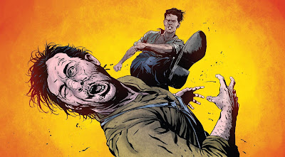
"Homecoming. Sort of"
Writer: Peter David
Artist: Will Sliney
Color: Jim Charalampidis

​This story had no business in this book, or any book for that matter. The story was pointless. We get that Spidey 2099 isn’t in 2099, and we didn’t need this pointless story to show us that. I can see Spidey 2099 coming up in ASM when Spidey and Spidey 2099’s paths will, have, or are going to cross in some important way, but this story does not have that kind of importance.

It’s just filler to up the price of this issue, and again, Marvel, Fuck You. This story was stupid, and you should be paying me for the time it took to read.

​On to the art of this crap story. Surprise, it was crap too.

The lines and inking were shit, and Spidey 2099 looked like crap. The lines showed too much detail about Spidey 2099, completely bringing me back to reality. Unfortunately, I kept reading on, and noticed the colors looked like some sort of retro/futuristic crap. It looked like Charalampidis wasn’t sure if he wanted this book to look futuristic in its color tone or retro, so he said, “fuck it, I’ll do both.” It didn’t work. I wish time travel was real like Spidey 2099 suggests, because then I could go back in time and tell Marvel, “You've got to do something about your kids!”

"Kaine"
Writer: Chris Yost
Penciler: David Baldeon
Inker: Jordi Tarragona
Color: Rachelle Rosenberg

​For “Kaine”, I’m going to start with what I liked, which was the art and color. It was a beautiful looking story and enjoyed the look of each panel immensely. Unfortunately this wasn’t an art book, it was a comic book, and the story here was crap.

Are we as readers supposed to believe that after returning as Spider-Man Peter Parker has time to go to Texas to check up on a friend? This is a guy who can’t make it to dinner on time, has just come back from death, and has to figure out what happened in his absence, but he has time for a fucking trip to Texas to check up on a friend. Again, Marvel, I have to say get your shit together. This story could have made sense down the road, but not in the first issue. Maybe if you weren’t trying to make this issue worth more; you wouldn’t have devalued it with more crap.

​In Closing on "Kaine", I didn’t like it.

Learning to Crawl: “Amazing Reality”
Writer: Dan Slott
Artist: Ramón Pérez
Color: Ian Herring

​Crap: that is the word I use to describe this story.

One, it didn’t belong in this issue. Two, the art and coloring were horrible. Three, the story was not even good.

​Let’s start with my first complaint. This was obviously another add-on to support the cost of this issue. In my opinion, it again did the opposite. It didn’t belong at all, and at the end it said to pick up ASM #1.1 to finish this crap. I don’t think so.

If you wanted me to read ASM #1.1 then you shouldn’t pull shit like this. I’m going to skip it just to spite you, Marvel.
​My second complaint was the art. It was not good. I could have colored this story better if all I did was eat some rainbow sherbet and puked it over the page. The inking was bad too, but the yellowish tone just got to me. I did not like it.

​Finally, the third problem with the story was that it was crap. It went nowhere and took its time getting there. I get that you want to sell ASM #1.1 Marvel, but do it with good storytelling, not by weighing your titles down with bad storytelling.

The last thing to review on this book is Inhuman #1.

Inhuman #1
Writer: Charles Soule
Artist: Joe Madureira
Color Artist: Marte Gracia
Letterer: VC’s Clayton Cowles

​This review is two-fold. First off, I’m going to say that Inhuman #1 didn’t belong at the end of ASM #1. I get that Marvel again is trying to add value to this issue by adding more on to it, but Inhuman mythos is too much to tack on to ASM #1. Especially since Marvel already showed us they don’t even trust us to remember Spidey’s abilities. Saying all of this though, I did enjoy Inhuman #1, and I hope it gets people to read more Inhuman titles.

​The story in Inhuman #1 was great. It filled in the gaps if you were behind a bit, and it had some great action and storytelling taking place. It developed the beautifully presented characters and made me care about what happen to the protagonists.

As you can see I’m trying not to ruin it for the reader.
The art and color were also great. It was very rich, but also harsh in tone like the story. It made me enjoy each panel immensely, and definitely made me want to buy the next issue. I liked it, so at least Marvel ended this book on a high note.

In summary, this book was like a sandwich. It had some great stories at the beginning, and one at the end with some crap in between. I still would recommend reading ASM #1, just skip the crap.